External Tags
Inline text style text
{% u text content %}
{% emp text content %}
{% wavy text content %}
{% del text content %}
{% kbd text content %}
{% psw text content %}- Text with underscore
- Text with
accent - Text with
- Text with
strikethrough - Keyboard style text command + D
- Password-style text:
no verification code here
1. Text with {% u underscore %}
2. Text with {% emp accent %}
3. Text with {% wavy %}
4. Text with {% del strikethrough %}
5. Keyboard style text {% kbd command %} + {% kbd D %}
6. Password-style text: {% psw no verification code here %}
Inline text span
{% span style parameters (parameters separated by spaces), text content %}- Font: logo, code
- Color: red,yellow,green,cyan,blue,{ % span gray, gray %}
- Size: small, h4, h3, h2, h1, large, huge, ultra
- Alignment direction: left, center, right
- Colored text
It is convenient to insert tags of various colors in a paragraph, including: red, yellow, green, cyan, blue, gray. - oversized text
The title section of the document’s Start page is just oversized text.
Volantis
A Wonderful Theme for Hexo
- Colored text
It is convenient to insert tags of various colors in a paragraph, including: {% span red, red%}, {% span yellow, yellow%}, {% span green, green%}, {% span cyan, cyan%}, {% span blue, blue%}, {% span gray, gray%}.
- oversized text
The title section of the document's Start page is just oversized text.
{% span center logo large, Volantis %}
{% span center small, A Wonderful Theme for Hexo %}
paragraph text p
{% p style parameters (parameters separated by spaces), text content %}- Font: logo, code
- Color: red,yellow,green,cyan,blue,{ % span gray, gray %}
- Size: small, h4, h3, h2, h1, large, huge, ultra
- Alignment direction: left, center, right
- Colored text
It is convenient to insert tags of various colors in a paragraph, including:red
,yellow
,green
,cyan
,blue
,gray
. - oversized text
The title section of the document’s Start page is just oversized text.Volantis
A Wonderful Theme for Hexo
- Colored text
It is convenient to insert tags of various colors in a paragraph, including: {% p red, red%}, {% p yellow, yellow%}, {% p green, green%}, {% p cyan, cyan%}, {% p blue, blue%}, {% p gray, gray%}.
- oversized text
The title section of the document's Start page is just oversized text.
{% p center logo large, Volantis %}
{% p center small, A Wonderful Theme for Hexo %}
Quote note
The latest version of the butterfly tag supports referencing the fontawesome V5 icon, which is better than the volantis note tag. Therefore, no additional volantis note style is introduced. It is very troublesome to do style adaptation. If you can be lazy, just be lazy
The following is the note writing of the butterfly theme.
Modify theme configuration file
note:
  # Note tag style values:
  # - simple bs-callout old alert style. Default.
  # - modern bs-callout new (v2-v3) alert style.
  # - flat flat callout style with background, like on Mozilla or StackOverflow.
  # - disabled disable all CSS styles import of note tag.
  style: simple
  icons: false
  border_radius: 3
  # Offset lighter of background in % for modern and flat styles (modern: -12 | 12; flat: -18 | 6).
  # Offset also applied to label tag variables. This option can work with disabled note tag.
  light_bg_offset: 0
The
Note tag plugin can be used in two ways. icons and light_bg_offset are only valid for method one.method one
{% note [class] [no-icon] [style] %}
Any content (support inline tags too.io).
{% endnote %}
method 2
{% note [color] [icon] [style] %}
Any content (support inline tags too.io).
{% endnote %}
method one
| parameters | usage |
|---|---|
| class | [Optional] Logo, different logos have different colors ( default / primary / success / info / warning / danger ) |
| no-icon | [Optional] Don’t show icon |
| style | [Optional] You can override style in the configuration (simple/modern/flat/disabled) |
method 2
| parameters | usage |
|---|---|
| class | [Optional] Logo, different logos have different colors ( default / blue / pink / red / purple / orange / green ) |
| no-icon | [Optional] You can configure a custom icon (only fontawesome icons are supported, or no-icon can be configured) |
| style | [Optional] You can override style in the configuration (simple/modern/flat/disabled) |
method one
simplestyledefault prompt block tag
default prompt block label
primary prompt block tag
success prompt block label
info tip block tag
warning prompt block label
danger prompt block tag
modernstyledefault prompt block tag
default prompt block tag
primary prompt block tag
success prompt block tag
info tip block tag
warning prompt block tag
danger prompt block tag
flatstyledefault tip block label
default prompt block label
primary tip block label
success prompt block label
info tip block label
warning prompt block label
danger tip block label
disabledstyledefault prompt block tag
default prompt block label
primary prompt block tag
success prompt block tag
info prompt block tag
warning prompt block label
danger prompt block tag
no-iconstyle
method 2
simple style
Are you swiping Visa or UnionPay
2021 is almost here….
Drive carefully and safety first
This is three pieces? Or four?
Are you using Visa or UnionPay
rock paper scissors
The most annoying browser on the front end
Modern style
Did you use Visa or UnionPay
2021 is almost here….
Drive carefully and safety first
This is three pieces? Or four?
Are you using Visa or UnionPay
rock paper scissors
The most annoying browser on the front end
Flat style
Are you using Visa or UnionPay
2021 is almost here….
Drive carefully and safety first
This is three pieces? Or four?
Are you using Visa or UnionPay
rock paper scissors
The most annoying browser on the front end
disabled style
Are you using Visa or UnionPay
2021 is almost here….
Drive carefully, safety comes first
This is three pieces? Or four?
Are you using Visa or UnionPay
rock paper scissors
The most annoying browser on the front end
no-icon style
method one
simplestyle{% note simple %}default prompt block tag{% endnote %} {% note default simple %}default prompt block label{% endnote %} {% note primary simple %}primary prompt block tag{% endnote %} {% note success simple %}success prompt block label{% endnote %} {% note info simple %}info tip block tag{% endnote %} {% note warning simple %}warning prompt block label{% endnote %} {% note danger simple %}danger prompt block tag{% endnote %}modernstyle{% note modern %}default prompt block tag{% endnote %} {% note default modern %}default prompt block tag{% endnote %} {% note primary modern %}primary prompt block tag{% endnote %} {% note success modern %}success prompt block tag{% endnote %} {% note info modern %}info tip block tag{% endnote %} {% note warning modern %}warning prompt block tag{% endnote %} {% note danger modern %}danger prompt block tag{% endnote %}flatstyle{% note flat %}default tip block label{% endnote %} {% note default flat %}default prompt block label{% endnote %} {% note primary flat %}primary tip block label{% endnote %} {% note success flat %}success prompt block label{% endnote %} {% note info flat %}info tip block label{% endnote %} {% note warning flat %}warning prompt block label{% endnote %} {% note danger flat %}danger tip block label{% endnote %}disabledstyle{% note disabled %}default prompt block tag{% endnote %} {% note default disabled %}default prompt block label{% endnote %} {% note primary disabled %}primary prompt block tag{% endnote %} {% note success disabled %}success prompt block tag{% endnote %} {% note info disabled %}info prompt block tag{% endnote %} {% note warning disabled %}warning prompt block label{% endnote %} {% note danger disabled %}danger prompt block tag{% endnote %}no-iconstyle{% note no-icon %}default prompt block label{% endnote %} {% note default no-icon %}default prompt block label{% endnote %} {% note primary no-icon %}primary tip block label{% endnote %} {% note success no-icon %}success prompt block label{% endnote %} {% note info no-icon %}info tip block label{% endnote %} {% note warning no-icon %}warning prompt block label{% endnote %} {% note danger no-icon %}danger tip block label{% endnote %}
method 2
simplestyle{% note 'fab fa-cc-visa' simple %}Are you swiping Visa or UnionPay{% endnote %} {% note blue 'fas fa-bullhorn' simple %}2021 is almost here....{% endnote %} {% note pink 'fas fa-car-crash' simple %}Drive carefully and safety first{% endnote %} {% note red 'fas fa-fan' simple%}This is three pieces? Or four? {% endnote %} {% note orange 'fas fa-battery-half' simple %}Are you using Visa or UnionPay{% endnote %} {% note purple 'far fa-hand-scissors' simple %}rock paper scissors{% endnote %} {% note green 'fab fa-internet-explorer' simple %}The most annoying browser on the front end{% endnote %}modernstyle{% note 'fab fa-cc-visa' modern %}Did you use Visa or UnionPay{% endnote %} {% note blue 'fas fa-bullhorn' modern %}2021 is almost here....{% endnote %} {% note pink 'fas fa-car-crash' modern %}Drive carefully and safety first{% endnote %} {% note red 'fas fa-fan' modern%}This is three pieces? Or four? {% endnote %} {% note orange 'fas fa-battery-half' modern %}Are you using Visa or UnionPay{% endnote %} {% note purple 'far fa-hand-scissors' modern %}rock paper scissors{% endnote %} {% note green 'fab fa-internet-explorer' modern %}The most annoying browser on the front end{% endnote %}flatstyle{% note 'fab fa-cc-visa' flat %}Are you using Visa or UnionPay{% endnote %} {% note blue 'fas fa-bullhorn' flat %}2021 is almost here....{% endnote %} {% note pink 'fas fa-car-crash' flat %}Drive carefully and safety first{% endnote %} {% note red 'fas fa-fan' flat%} This is three pieces? Or four? {% endnote %} {% note orange 'fas fa-battery-half' flat %}Are you using Visa or UnionPay{% endnote %} {% note purple 'far fa-hand-scissors' flat %}rock paper scissors{% endnote %} {% note green 'fab fa-internet-explorer' flat %}The most annoying browser on the front end{% endnote %}disabledstyle{% note 'fab fa-cc-visa' disabled %}Are you using Visa or UnionPay{% endnote %} {% note blue 'fas fa-bullhorn' disabled %}2021 is almost here....{% endnote %} {% note pink 'fas fa-car-crash' disabled %}Drive carefully, safety comes first{% endnote %} {% note red 'fas fa-fan' disabled %}This is three pieces? Or four? {% endnote %} {% note orange 'fas fa-battery-half' disabled %}Are you using Visa or UnionPay{% endnote %} {% note purple 'far fa-hand-scissors' disabled %}rock paper scissors{% endnote %} {% note green 'fab fa-internet-explorer' disabled %}The most annoying browser on the front end{% endnote %}no-iconstyle{% note no-icon %}Did you swipe Visa or UnionPay{% endnote %} {% note blue no-icon %}2021 is almost here....{% endnote %} {% note pink no-icon %}Drive carefully and safety first{% endnote %} {% note red no-icon %} is this three pieces? Or four? {% endnote %} {% note orange no-icon %}Are you swiping Visa or UnionPay{% endnote %} {% note purple no-icon %}rock paper scissors{% endnote %} {% note green no-icon %}The most annoying browser on the front end{% endnote %}
superscript tag tip
The main style is referenced from [Xiaokang’s butterfly gradient background label] (https://www.antmoe.com/posts/3b43914f/), I wrote a tip.js to render the label, and simplified the code.
{% tip [parameter, optional] %}Text content{% endtip %}- Style: success,error,warning,bolt,ban,home,sync,cogs,key,bell
- Custom icons: support fontawesome.
default
info
success
error
warning
bolt
ban
home
sync
cogs
key
bell
custom font awesome icon
{% tip %}default{% endtip %}
{% tip info %}info{% endtip %}
{% tip success %}success{% endtip %}
{% tip error %}error{% endtip %}
{% tip warning %}warning{% endtip %}
{% tip bolt %}bolt{% endtip %}
{% tip ban %}ban{% endtip %}
{% tip home %}home{% endtip %}
{% tip sync %}sync{% endtip %}
{% tip cogs %}cogs{% endtip %}
{% tip key %}key{% endtip %}
{% tip bell %}bell{% endtip %}
{% tip fa-atom %} custom font awesome icon{% endtip %}
dynamic tag anima
The essence of dynamic tags is to refer to the CSS style of font-awesome-animation, which is not necessarily limited to tip tags, but can also be other tags.
It’s just that tip.js is written by myself, so I know how it will be rendered into html, so I use this writing method.
You can read the documentation and use the html language to write other tag types.
{% tip [parameter, optional] %}Text content{% endtip %}For more details, please refer to the font-awesome-animation documentation
- Add the required CSS classes to the icon (or any element in the DOM).
- For the parent hover style, you need to add the specified CSS class to the target element, and also add the CSS class
faa-parent animated-hoverto the parent element of the target element. (See example and example source code for details)
You can regulate the speed of the animation by adding the CSS class or . faa-fastfaa-slow - You can control the animation speed by adding the CSS class
faa-fastorfaa-slowto the target element.
| On DOM load When the page loads Show animation |
On hover When mouseover Show animation |
On parent hover When mouseover On parent element When show animation |
|---|---|---|
| faa-wrench animated | faa-wrench animated-hover | faa-wrench |
| faa-ring animated | faa-ring animated-hover | faa-ring |
| faa-horizontal animated | faa-horizontal animated-hover | faa-horizontal |
| faa-vertical animated | faa-vertical animated-hover | faa-vertical |
| faa-flash animated | faa-flash animated-hover | faa-flash |
| faa-bounce animated | faa-bounce animated-hover | faa-bounce |
| faa-spin animated | faa-spin animated-hover | faa-spin |
| faa-tada animated | faa-tada animated-hover | faa-tada |
| faa-pulse animated | faa-pulse animated-hover | faa-pulse |
| faa-shake animated | faa-shake animated-hover | faa-shake |
| faa-tada animated | faa-tada animated-hover | faa-tada |
| faa-passing animated | faa-passing animated-hover | faa-passing |
| faa-passing-reverse animated | faa-passing-reverse animated-hover | faa-passing-reverse |
| faa-burst animated | faa-burst animated-hover | faa-burst |
| faa-falling animated | faa-falling animated-hover | faa-falling |
| faa-rising animated | faa-rising animated-hover | faa-rising |
On DOM load (show animation when page loads)
warning
ban
Adjust the animation speed.
warning
ban
On hover (display animation when the mouse is hovered)
warning
ban
On parent hover (display animation when the mouse hovers over the parent element)
warning
ban
On DOM load (show animation when page loads)
{% tip warning faa-horizontal animated %}warning{% endtip %}
{% tip ban faa-flash animated %}ban{% endtip %}
Adjust the animation speed
{% tip warning faa-horizontal animated faa-fast %}warning{% endtip %}
{% tip ban faa-flash animated faa-slow %}ban{% endtip %}
On hover (display animation when the mouse is hovered)
{% tip warning faa-horizontal animated-hover %}warning{% endtip %}
{% tip ban faa-flash animated-hover %}ban{% endtip %}
On parent hover (display animation when the mouse hovers over the parent element)
{% tip warning faa-parent animated-hover %}<p class="faa-horizontal">warning</p>{% endtip %}
{% tip ban faa-parent animated-hover %}<p class="faa-flash">ban</p>{% endtip %}
Checklist checkbox
{% checkbox style parameter (optional), text (support simple md) %}
```
<!-- endtab -->
<!-- tab configuration parameters -->
1. Style: plus, minus, times
2. Color: {% span red, red %},{% span yellow, yellow %},{% span green, green %},{% span cyan, cyan %},{% span blue, blue %},{ % span gray, gray %}
3. Checked status: checked
<!-- endtab -->
<!-- tab style preview -->
{% checkbox plain text test %}
{% checkbox checked, supports simple [markdown](https://guides.github.com/features/mastering-markdown/) syntax %}
{% checkbox red, support custom color %}
{% checkbox green checked, green + default checked %}
{% checkbox yellow checked, yellow + default checked %}
{% checkbox cyan checked, cyan + default checked %}
{% checkbox blue checked, blue + default checked %}
{% checkbox plus green checked, increase %}
{% checkbox minus yellow checked, reduce %}
{% checkbox times red checked, fork %}
<!-- endtab -->
<!-- tab example source code -->
````markdown
{% checkbox plain text test %}
{% checkbox checked, supports simple [markdown](https://guides.github.com/features/mastering-markdown/) syntax %}
{% checkbox red, support custom color %}
{% checkbox green checked, green + default checked %}
{% checkbox yellow checked, yellow + default checked %}
{% checkbox cyan checked, cyan + default checked %}
{% checkbox blue checked, blue + default checked %}
{% checkbox plus green checked, increase %}
{% checkbox minus yellow checked, reduce %}
{% checkbox times red checked, fork %}
Radio list radio
{% radio style parameter (optional), text (supports simple md) %}- Color: red,yellow,green,cyan,blue,{ % span gray, gray %}
- Checked status: checked
{% radio plain text test %}
{% radio checked, supports simple [markdown](https://guides.github.com/features/mastering-markdown/) syntax %}
{% radio red, support custom color %}
{% radio green, green %}
{% radio yellow, yellow %}
{% radio cyan, cyan %}
{% radio blue, blue %}
Timeline timeline
After the plugin version v1.0.16, in order to avoid conflicts with the timeline plugin in Butterfly_v4.0+, the timeline plugin in the plugin has been removed. For users who are lower than Butterfly_v4.0, please upgrade the theme or install version 1.0.15. Plug-in label plugin, or add timeline.js and timeline.styl files to the corresponding folder. Users who use the original timeline plug-in label are affected by the replacement syntax format.
Butterfly_v4.0+’s own timeline plug-in label style is more beautiful. Grammar and semantics are also clearer.
{% timeline timeline title (optional) [,color] %}
<!-- timeline time node (title) -->
Text content
<!-- endtimeline -->
<!-- timeline time node (title) -->
Text content
<!-- endtimeline -->
{% endtimeline %}| Parameters | Explanation |
|---|---|
| title | Title/Timeline |
| color | timeline color: default (leave blank) / blue / pink / red / purple / orange / green |
timeline style
2020-05-15 2.6.3 -> 2.6.6
No additional processing is required.
2020-04-20 2.6.2 -> 2.6.3
- Globally search for
seotitleand replace withseo_title. - The indexing rules of the group component have changed. In articles using the group component, the component name corresponding to
group: group_namemust begroup_name. - The list name of the group component displays the
short_titleof the article first followed by thetitle.
{% timeline timeline style,blue %}

<!-- timeline 2020-07-24 [2.6.6 -> 3.0](https://github.com/volantis-x/hexo-theme-volantis/releases) -->

1. If you have the `hexo-lazyload-image` plugin, you need to delete and reinstall the latest version, set `lazyload.isSPA: true`.
2. The css and js of the 2.x version do not work with the 3.x version and need to be removed if `use_cdn: true` is used.
3. The fancybox tag from version 2.x was renamed to gallery in version 3.x.
4. The 2.x version of the top `top: true` has been changed to `pin: true`, and the same applies to the `layout: page` page.
5. If the `hexo-offline` plugin is used, it is recommended to uninstall it. The pjax service is enabled by default in version 3.0.

<!-- endtimeline -->

<!-- timeline 2020-05-15 [2.6.3 -> 2.6.6](https://github.com/volantis-x/hexo-theme-volantis/releases/tag/2.6.6) -->

No additional processing is required.

<!-- endtimeline -->

<!-- timeline 2020-04-20 [2.6.2 -> 2.6.3](https://github.com/volantis-x/hexo-theme-volantis/releases/tag/2.6.3) -->

1. Globally search for `seotitle` and replace with `seo_title`.
2. The indexing rules of the group component have changed. In articles using the group component, the component name corresponding to `group: group_name` must be `group_name`.
2. The list name of the group component displays the `short_title` of the article first followed by the `title`.

<!-- endtimeline -->

{% endtimeline %}
link card link
{% link title, link, image link (optional) %}{% link Candy House Tutorial Posts, https://akilar.top/posts/615e2dec/, https://npm.elemecdn.com/akilar-candyassets/image/siteicon/favicon.ico %}button btns
Volantis buttons use the btn and btns tags. btns does not conflict with the button of butterfly, but btn will be forced to render, causing some parameters to be invalid, and the effect of btn is still better than the button of butterfly. So it is only adapted to btns.
{% btns style parameter %}
{% cell title, link, image or icon %}
{% cell title, link, image or icon %}
{% endbtns %}- Rounded corner style: rounded, circle
- Add text style: you can add
<b>title</b>and<p>description text</p>in the container - Layout:
The default is auto-width, which is good for situations where there are only one or two in the field of view.
| parameters | meaning |
|---|---|
| wide | A wider button |
| fill | Fill the layout, automatically fill at least one line, more lines will wrap |
| center | Centering, fixed spacing between buttons |
| around | Centering and Scattering |
| grid2 | Equal width up to 2 columns, the number of columns will be appropriately reduced when the screen becomes narrow |
| grid3 | Equal width up to 3 columns, the number of columns will be appropriately reduced when the screen becomes narrow |
| grid4 | Equal width up to 4 columns, narrowing the screen will appropriately reduce the number of columns |
| grid5 | Equal width up to 5 columns, the number of columns will be appropriately reduced when the screen becomes narrow |
If you need to display a set of links with avatars like “team members”:
Or a button with an icon:
Round Icon + Title + Description + Image + Grid 5 Columns + Center
- If you need to display a set of links with avatars like “team members”:
{% btns circle grid5 %} {% cell xaoxuu, https://xaoxuu.com, https://cdn.jsdelivr.net/gh/xaoxuu/cdn-assets/avatar/avatar.png %} {% cell xaoxuu, https://xaoxuu.com, https://cdn.jsdelivr.net/gh/xaoxuu/cdn-assets/avatar/avatar.png %} {% cell xaoxuu, https://xaoxuu.com, https://cdn.jsdelivr.net/gh/xaoxuu/cdn-assets/avatar/avatar.png %} {% cell xaoxuu, https://xaoxuu.com, https://cdn.jsdelivr.net/gh/xaoxuu/cdn-assets/avatar/avatar.png %} {% cell xaoxuu, https://xaoxuu.com, https://cdn.jsdelivr.net/gh/xaoxuu/cdn-assets/avatar/avatar.png %} {% endbtns %} - Or a button with an icon:
{% btns rounded grid5 %} {% cell download source code, /, fas fa-download %} {% cell view document, /, fas fa-book-open %} {% endbtns %} - Round Icon + Title + Description + Image + Grid 5 Columns + Center
{% btns circle center grid5 %}
<a href='https://apps.apple.com/cn/app/heart-mate-pro-hrm-utility/id1463348922?ls=1'>
  <i class='fab fa-apple'></i>
  <b>Heart Rate Manager</b>
  {% p red, pro %}
  <img src='https://cdn.jsdelivr.net/gh/xaoxuu/cdn-assets/qrcode/heartmate_pro.png'>
</a>
<a href='https://apps.apple.com/cn/app/heart-mate-lite-hrm-utility/id1475747930?ls=1'>
  <i class='fab fa-apple'></i>
  <b>Heart Rate Manager</b>
  {% p green, free version %}
  <img src='https://cdn.jsdelivr.net/gh/xaoxuu/cdn-assets/qrcode/heartmate_lite.png'>
</a>
{% endbtns %}
github card ghcard
ghcard uses the github-readme-stats API, which supports writing directly using markdown syntax.
{% ghcard username, other parameters (optional) %}
{% ghcard username/repository, other parameters (optional) %}
For more parameters, please refer to:
Use , to separate each parameter. Written as: parameter name = parameter value
Below are just a few commonly used parameter values.
| Parameter name | Value | Interpretation |
|---|---|---|
| hide | stars,commits,prs,issues,contribs | Hide specified statistics |
| count_private | true | Add private project contributions to total commit count |
| show_icons | true | Show Icons |
| theme | Please refer to Available Themes | theme |
- User Information Card
|
|
|---|---|
|
|
|
|
|
|
- Warehouse Information Card
|
|
|---|---|
|
|
|
|
|
|
User Information Card
| {% ghcard xaoxuu %} | {% ghcard xaoxuu, theme=vue %} | | -- | -- | | {% ghcard xaoxuu, theme=buefy %} | {% ghcard xaoxuu, theme=solarized-light %} | | {% ghcard xaoxuu, theme=onedark %} | {% ghcard xaoxuu, theme=solarized-dark %} | | {% ghcard xaoxuu, theme=algolia %} | {% ghcard xaoxuu, theme=calm %} |- Warehouse Information Card
| {% ghcard volantis-x/hexo-theme-volantis %} | {% ghcard volantis-x/hexo-theme-volantis, theme=vue %} |
| -- | -- |
| {% ghcard volantis-x/hexo-theme-volantis, theme=buefy %} | {% ghcard volantis-x/hexo-theme-volantis, theme=solarized-light %} |
| {% ghcard volantis-x/hexo-theme-volantis, theme=onedark %} | {% ghcard volantis-x/hexo-theme-volantis, theme=solarized-dark %} |
| {% ghcard volantis-x/hexo-theme-volantis, theme=algolia %} | {% ghcard volantis-x/hexo-theme-volantis, theme=calm %} |
github logo ghbdage
For more specific usage of ghbdage parameters, please refer to the tutorial on the site: Add github logo
{% bdage [right],[left],[logo]||[color],[link],[title]||[option] %}left: the information on the left side of the logo, a required parameter.right: the information on the right side of the logo, a required parameter,logo: Logo icon, see simpleicons for the icon name, optional parameter.color: The color of the right side of the logo, optional parameter.link: the link to point to, optional parameter.title: Additional information about the logo, optional parameter. Mainly used to optimize SEO, but theobjecttag does not display thetitleinformation on mouseover like theatag.option: custom parameter, supports all API parameters of shields.io. For specific parameters, please refer to the extended writing example above. The form isname1=value2&name2=value2.
The parameters of this plug-in tag are divided into three groups, which are separated by ||.
- Basic parameters
- Information parameters
- Extended parameters
The parameters of this plug-in tag are divided into three groups, which are separated by ||.
- Basic parameters, define the left and right text and icons of the logo
{% bdage Theme,Butterfly %} {% bdage Frame,Hexo,hexo %} - Information parameters, define the background color of the content on the right side of the logo, and point to the link
{% bdage CDN, JsDelivr, jsDelivr||abcdef, https://metroui.org.ua/index.html, this site uses JsDelivr to provide CDN acceleration for static resources %} //If optional parameters are omitted across the sequence, you still need to write a comma for separation {% bdage Source,GitHub,GitHub||,https://github.com/ %} - Expand parameters to support all parameters of shields API
{% bdage Hosted,Vercel,Vercel||brightgreen,https://vercel.com/, this site adopts two-line deployment, the default line is hosted in Vercel||style=social&logoWidth=20 %}
//If the optional parameter group is omitted across the sequence, you still need to write a double vertical bar || for separation
{% bdage Hosted,Vercel,Vercel||||style=social&logoWidth=20&logoColor=violet %}
website card sites
{% sitegroup %}
{% site title, url=link, screenshot=screenshot link, avatar=avatar link (optional), description=description (optional) %}
{% site title, url=link, screenshot=screenshot link, avatar=avatar link (optional), description=description (optional) %}
{% endsitegroup %}{% sitegroup %}
{% site xaoxuu, url=https://xaoxuu.com, screenshot=https://i.loli.net/2020/08/21/VuSwWZ1xAeUHEBC.jpg, avatar=https://cdn.jsdelivr.net/gh /xaoxuu/cdn-assets/avatar/avatar.png, description=Simple style%}
{% site inkss, url=https://inkss.cn, screenshot=https://i.loli.net/2020/08/21/Vzbu3i8fXs6Nh5Y.jpg, avatar=https://cdn.jsdelivr.net/gh /inkss/common@master/static/web/avatar.jpg, description=This is a description of this website %}
{% site MHuiG, url=https://blog.mhuig.top, screenshot=https://i.loli.net/2020/08/22/d24zpPlhLYWX6D1.png, avatar=https://cdn.jsdelivr.net /gh/MHuiG/imgbed@master/data/p.png, description=This is a description of this site %}
{% site Colsrch, url=https://colsrch.top, screenshot=https://i.loli.net/2020/08/22/dFRWXm52OVu8qfK.png, avatar=https://cdn.jsdelivr.net/gh /Colsrch/images/Colsrch/avatar.jpg, description=This is a description of this site %}
{% site Linhk1606, url=https://linhk1606.github.io, screenshot=https://i.loli.net/2020/08/21/3PmGLCKicnfow1x.png, avatar=https://i.loli.net /2020/02/09/PN7I5RJfFtA93r2.png, description=This is a description of this website%}
{% endsitegroup %}inline image inlineimage
{% inlineimage image link, height=height (optional) %}- Height: height=20px
This is paragraph.
This is another paragraph.
This is {% inlineimage https://cdn.jsdelivr.net/gh/volantis-x/cdn-emoji/aru-l/0000.gif %} paragraph.

This is another {% inlineimage https://cdn.jsdelivr.net/gh/volantis-x/cdn-emoji/aru-l/5150.gif, height=40px %} paragraph.
single image image
{% image link, width=width(optional), height=height(optional), alt=description(optional), bg=placeholder color(optional) %}- Image width and height: width=300px, height=32px
- Image description: alt=image description (butterfly needs to enable image description in the theme configuration file)
- Placeholder background color: bg=#f2f2f2
Add a description:
The way back to the dormitory after class every daySpecify the width:
Specify the width and add a description:
The way back to the dormitory after class every daySet the placeholder background color:
Optimize the look and feel of browsing with different widths
Add a description:
{% image https://cdn.jsdelivr.net/gh/volantis-x/cdn-wallpaper-minimalist/2020/025.jpg, alt=The way back to the dormitory after class every day, there is no story. %}- Specify the width:
{% image https://cdn.jsdelivr.net/gh/volantis-x/cdn-wallpaper-minimalist/2020/025.jpg, width=400px %} - Specify the width and add a description:
{% image https://cdn.jsdelivr.net/gh/volantis-x/cdn-wallpaper-minimalist/2020/025.jpg, width=400px, alt=The way back to the dormitory after class every day, there is no story. %} - Set the placeholder background color:
{% image https://cdn.jsdelivr.net/gh/volantis-x/cdn-wallpaper-minimalist/2020/025.jpg, width=400px, bg=#1D0C04, alt=Optimize the look and feel of browsing with different widths %}
audio audio
{% audio audio link %}{% audio https://github.com/volantis-x/volantis-docs/releases/download/assets/Lumia1020.mp3 %}videos video
{% video video link %}- Orientation: left, center, right
- Number of columns: write the number of columns directly after the comma, 1 to 4 columns are supported.
100% width
50% width
25% width
100% width
{% video https://github.com/volantis-x/volantis-docs/releases/download/assets/IMG_0341.mov %}50% width
{% videos, 2 %}
{% video https://github.com/volantis-x/volantis-docs/releases/download/assets/IMG_0341.mov %}
{% video https://github.com/volantis-x/volantis-docs/releases/download/assets/IMG_0341.mov %}
{% video https://github.com/volantis-x/volantis-docs/releases/download/assets/IMG_0341.mov %}
{% video https://github.com/volantis-x/volantis-docs/releases/download/assets/IMG_0341.mov %}
{% endvideos %}
25% width
{% videos, 4 %}
{% video https://github.com/volantis-x/volantis-docs/releases/download/assets/IMG_0341.mov %}
{% video https://github.com/volantis-x/volantis-docs/releases/download/assets/IMG_0341.mov %}
{% video https://github.com/volantis-x/volantis-docs/releases/download/assets/IMG_0341.mov %}
{% video https://github.com/volantis-x/volantis-docs/releases/download/assets/IMG_0341.mov %}
{% video https://github.com/volantis-x/volantis-docs/releases/download/assets/IMG_0341.mov %}
{% video https://github.com/volantis-x/volantis-docs/releases/download/assets/IMG_0341.mov %}
{% video https://github.com/volantis-x/volantis-docs/releases/download/assets/IMG_0341.mov %}
{% video https://github.com/volantis-x/volantis-docs/releases/download/assets/IMG_0341.mov %}
{% endvideos %}
photo album gallery
Butterfly comes with a gallery album, and it will automatically adjust the layout according to the size of the picture. The effect is better than the gallery of Volantis, so the gallery tag of Volantis is no longer included.
The following is the gallery tag that comes with Butterfly. Albums Gallery works with albums.
gallerygroup photo gallery
<div class="gallery-group-main">
{% galleryGroup name description link img-url %}
{% galleryGroup name description link img-url %}
{% galleryGroup name description link img-url %}
</div>
gallery album
{% gallery %}
markdown image format
{% endgallery %}
- gallerygroup photo gallery
| Parameter name | Definition |
|---|---|
| name | Gallery name |
| description | Gallery description |
| link | Link to the address of the corresponding album |
| img-url | Gallery Cover |
Think about it, the essence of the album gallery is actually a shortcut, which can be customized to add descriptions, covers, and links. Then we don’t have to use it as an album, it can be used as a link card, and it is a good choice to link to video, QQ, and Friendship Chain.
- gallery albums
Different from the old version of the Gallery album, the new Gallery album will be automatically typeset according to the length of the picture, and the writing is also more convenient, the same as the markdown format. Can be inserted into the corresponding md as needed. You don’t need to configure the length and width yourself. **It is recommended to deliberately use pictures of different lengths, sizes, and horizontal and vertical when pasting, which will have better results. (images of the exact same size will only be output tiled, which is terrible)
Links to gallerygroup and gallery album pages that many students have asked. Here are my personal habits.
Generally, if you use the album gallery, you can add a gallery page in the navigation bar ( use the command hexo new page gallery to add ), and put the album gallery as the cover. Then create a corresponding folder under [Blogroot]/source/gallery/. For example, if you follow the example here, if you want to use the /gallery/MC/ path to access the MC album, you need to create a new [Blogroot]/source /gallery/MC/index.md, and fill in the content of the gallery album.
gallerygroup photo gallery
<div class="gallery-group-main">
{% galleryGroup MC's footprint in Rikka's Rokka server '/gallery/MC/' https://npm.elemecdn.com/akilar-candyassets/image/1.jpg %}
{% galleryGroup Gundam Oh wow gundam! '/gallery/Gundam/' https://npm.elemecdn.com/akilar-candyassets/image/20200907110508327.png %}
{% galleryGroup I-am-Akilar is a selfie in a sense '/gallery/I-am-Akilar/' https://npm.elemecdn.com/akilar-candyassets/image/20200907113116651.png %}
</div>
gallery album
{% gallery %}                    {% endgallery %}
Folding frame folding
Although Butterfly also has a built-in folding box hideToggle tag, the folding folding box of Volantis looks better.
{% folding parameters (optional), title %}
{% endfolding %}- Color: blue, cyan, green, yellow, red
- Status: Fill in the status open means it is open by default.
view image test
view the default open folding box
This is a collapsed box that is open by default.
see code test
see list test
- haha
- hehe
see nested tests
see nested test 2
see nested test 3
hahaha
{% folding view image test %}

{% endfolding %}
{% folding cyan open, view the default open folding box %}
This is a collapsed box that is open by default.
{% endfolding %}
{% folding green, see code test %}
Pretend there are code blocks here (code blocks cannot nest code blocks)
{% endfolding %}
{% folding yellow, see list test %}
- haha
- hehe
{% endfolding %}
{% folding red, see nested tests %}
{% folding blue, see nested test 2 %}
{% folding see nested test 3 %}
hahaha <span><img src='https://cdn.jsdelivr.net/gh/volantis-x/cdn-emoji/tieba/%E6%BB%91%E7%A8%BD.png' style='height :24px'></span>
{% endfolding %}
{% endfolding %}
{% endfolding %}Column tab
The tab tag of Butterfly and the tab tag of Volantis are shifted from the NexT theme, so the writing and effect are exactly the same.
{% tabs Unique name, [index] %}
<!-- tab [Tab caption] [@icon] -->
Any content (support inline tags too).
<!-- endtab -->
{% endtabs %}
- Unique name:
- Unique name for the tab block label without commas.
- will be used in #id as a prefix for each tag and its index number.
- If the name contains spaces, all spaces will be replaced by dashes for #id generation.
- Only the URL of the current post/page must be unique!
- [index]:
- The index number of the active tab.
- If not specified, the first tab (1) will be selected.
- If index is -1, no tabs will be selected.
- optional parameter.
- [Tab caption]:
- The title of the current tab.
- If no title is specified, a unique name with a tab index suffix will be used as the title of the tab.
- If no title is specified, but an icon is specified, the title will be empty.
- optional parameter.
- [@icon]:
- FontAwesome icon name (full name, looks like “fas fa-font”)
- can be specified with or without spaces;
- For example ‘Tab caption @icon’ and ‘Tab caption@icon’.
- optional parameter.
Demo 1 - Preset selection first [Default]
This is Tab 1.
This is Tab 2.
This is Tab 3.
Demo 2 - Default selection tabs
This is Tab 1.
This is Tab 2.
This is Tab 3.
Demo 3 - no presets
This is Tab 1.
This is Tab 2.
This is Tab 3.
Demo 4 - Custom Tab Name + Only Icon + Icon and Tab Name
tab name is the first tab
Only icons, no tab names
name+icon
Demo 1 - Preset selection first [Default]
{% tabs test1 %}
<!-- tab -->
**This is Tab 1.**
<!-- endtab -->

<!-- tab -->
**This is Tab 2.**
<!-- endtab -->

<!-- tab -->
**This is Tab 3.**
<!-- endtab -->
{% endtabs %}
Demo 2 - Default selection tabs
{% tabs test2, 3 %}
<!-- tab -->
**This is Tab 1.**
<!-- endtab -->

<!-- tab -->
**This is Tab 2.**
<!-- endtab -->

<!-- tab -->
**This is Tab 3.**
<!-- endtab -->
{% endtabs %}
Demo 3 - no presets
{% tabs test3, -1 %}
<!-- tab -->
**This is Tab 1.**
<!-- endtab -->

<!-- tab -->
**This is Tab 2.**
<!-- endtab -->

<!-- tab -->
**This is Tab 3.**
<!-- endtab -->
{% endtabs %}
Demo 4 - Custom Tab Name + Only Icon + Icon and Tab Name
{% tabs test4 %}
<!-- tab first Tab -->
**tab name is the first tab**
<!-- endtab -->

<!-- tab @fab fa-apple-pay -->
**Only icons, no tab names**
<!-- endtab -->

<!-- tab bomb @fas fa-bomb -->
**name+icon**
<!-- endtab -->
{% endtabs %}
Data collection issues
{% issues type | api=url | group=key:value1,value2 (optional) %}type:
According to different requirements, the content of issues will be parsed into different HTML tags. Currently supported types are:
- Timeline
timeline: parsed intotimelinelabel, the title ofissuecorresponds to the time oftimeline, and the content ofissuecorresponds to the content oftimeline. Website card
sites: parsed intositestag, requires aJSONcode block, each parameter corresponds to thesitestag parameter:{ "title": "", "screenshot": "", "url": "", "avatar": "", "description": "", ""keywords"": "" }
| Parameters | Interpretation |
|---|---|
| title | Site name |
| screenshot | Website Preview |
| url | Website link, you need to add https:// protocol to form a complete domain name. Otherwise it may be recognized as a site-relative path. |
| avatar | Webmaster Avatar |
| “keywords” | Group basis, It is not necessary to call “keywords”, see group below for details |
api (interface):
The url is a callable API, for example:
api=https://gitee.com/api/v5/repos/xaoxuu/friends/issues?sort=updated&state=open&page=1&per_page=100&labels=active
api=https://api.github.com/repos/xaoxuu/friends/issues?sort=updated&state=open&page=1&per_page=100&labels=active| Parameters | Interpretation |
|---|---|
| https://gitee.com/api/v5/ | api for gitee repository |
| https://api.github.com/ | api for github repository |
| repos/xaoxuu/friends/issues | repos/username/repository name/issues |
| sort=updated&state=open | Define which types of issues will be read and rendered into corresponding tags |
| page=1&per_page=100 | Read the first 100 issues |
| labels=active | Controls the default issue not to be displayed, Only after the active label is added through the review It will be displayed |
group:
The issues of the sites type are not grouped by default. If you need to group, you can specify the grouping basis "keywords", and the grouping whitelist "value1", "value2", etc., for example:
group=version:v4,v3,v2
# The version here is the "keywords" above
The function of this parameter is to filter out the data that contains "version": "v4" or "version":"v3" or "version": "v2" in JSON, and display them in groups.
warehouse ISSUES template configuration
Github warehouse configuration scheme
Create a new warehouse, the warehouse name is arbitrary, here I named it
friend_link,
Create a new filefriend_link\.github\ISSUE_TEMPLATE.md,
and enter the following in it as theissuestemplate.Remember to delete the backslash in front of the json code block. This is mainly written here to escape, otherwise code blocks cannot be nested.
---
name: Friendship template
about: Please fill in the link format according to the instructions.
---

<!-- Please fill in the double quotes in the code block below -->
\```json
{
    "title": "",
    "screenshot": "",
    "url": "",
    "avatar": "",
    "description": "",
    "keywords": ""
}
\```

<!--
"title": "Site name",
"screenshot": "Site Preview Link",
"url": "Site link",
"avatar": "avatar link",
"description": "Site description",
"keywords": "Keywords, as group names"
-->

<!-- Example -->

<!--
"title": "AkilarのCandy House",
"screenshot": "https://cdn.jsdelivr.net/gh/Akilarlxh/ScreenShot@gh-pages/akilar.top.jpg",
"url": "https://akilar.top/",
"avatar": "https://npm.elemecdn.com/akilar-candyassets/image/siteicon/favicon.png",
"description": "Looking forward to seeing you!",
"keywords": "Candy House"
-->
Create a new active label
Submit an example
There is a period of API cache period from the approval to the page reading, so be patient.
Gitee warehouse configuration
Create a new warehouse, the warehouse name is arbitrary, here I named it
friend_link,
Create a new filefriend_link\.gitee\ISSUE_TEMPLATE.md,
and enter the following in it as theissuestemplate.Remember to delete the backslash in front of the json code block. This is mainly written here to escape, otherwise code blocks cannot be nested.
---
name: Friendship template
about: Please fill in the link format according to the instructions.
---

<!-- Please fill in the double quotes in the code block below -->
\```json
{
    "title": "",
    "screenshot": "",
    "url": "",
    "avatar": "",
    "description": "",
    "keywords": ""
}
\```

<!--
"title": "Site name",
"screenshot": "Site Preview Link",
"url": "Site link",
"avatar": "avatar link",
"description": "Site description",
"keywords": "Keywords, as group names"
-->

<!-- Example -->

<!--
"title": "AkilarのCandy House",
"screenshot": "https://cdn.jsdelivr.net/gh/Akilarlxh/ScreenShot@gh-pages/akilar.top.jpg",
"url": "https://akilar.top/",
"avatar": "https://npm.elemecdn.com/akilar-candyassets/image/siteicon/favicon.png",
"description": "Looking forward to seeing you!",
"keywords": "Candy House"
-->
Create a new active tag
Submit an example
There is a period of API cache period from the approval to the page reading, so be patient.
Timeline label
timelinerendering
Corresponding repositoryissueslink:Rendering of the site card tag
sitesgitee repository example
Corresponding repository
issueslink:Rendered label:
github repository example
Corresponding repository
issueslink:Rendered label:
Group rendering of site card label
sites
Here is the data from the “Example Blog” page of theVolantistheme website:
Corresponding repositoryissueslink:Rendered label:
Timeline label
timelinerendering{% issues timeline | api=https://gitee.com/api/v5/repos/xaoxuu/timeline/issues?state=open&creator=xaoxuu&sort=created&direction=desc&page=1&per_page=100 %}Rendering of the site card tag
sitesgitee repository example
{% issues sites | api=https://gitee.com/api/v5/repos/xaoxuu/friends/issues?sort=updated&state=open&page=1&per_page=100&labels=active %}github repository example
{% issues sites | api=https://api.github.com/repos/xaoxuu/friends/issues?sort=updated&state=open&page=1&per_page=100&labels=active %}
Group rendering of site card label
sites
Here is the data from the “Example Blog” page of theVolantistheme website:{% issues sites | api=https://api.github.com/repos/volantis-x/examples/issues?sort=updated&state=open&page=1&per_page=100 | group=version:version:^4.0,version:^3.0 , version: ^2.0 %}
Poem Tags poem
{% poem [title],[author] %}
Poetry content
{% endpoem %}- title: the title of the poem
- author: the author, can not write
明月几时有?把酒问青天。
不知天上宫阙,今夕是何年?
我欲乘风归去,又恐琼楼玉宇,高处不胜寒。
起舞弄清影,何似在人间?
转朱阁,低绮户,照无眠。
不应有恨,何事长向别时圆?
人有悲欢离合,月有阴晴圆缺,此事古难全。
但愿人长久,千里共婵娟。
{% poem 水调歌头,苏轼 %}
丙辰中秋,欢饮达旦,大醉,作此篇,兼怀子由。
明月几时有?把酒问青天。
不知天上宫阙,今夕是何年?
我欲乘风归去,又恐琼楼玉宇,高处不胜寒。
起舞弄清影,何似在人间?

转朱阁,低绮户,照无眠。
不应有恨,何事长向别时圆?
人有悲欢离合,月有阴晴圆缺,此事古难全。
但愿人长久,千里共婵娟。
{% endpoem %}
Ali icon icon
The icon of this label needs to introduce the style of Ali vector icon library by itself. Please move to the specific introduction scheme: Hexo introduces Ali vector icon library
{% icon [icon-xxxx],[font-size] %}icon-xxxx: represents the iconfont-class, which can be queried and copied in thefont-classreference scheme of your own Ali vector icon library project.font-size: indicates the size of the icon, just fill in the number directly, the unit isem. The default icon size is1em.
{% icon icon-rat_zi %}{% icon icon-rat,2 %}

{% icon icon-ox_chou,3 %}{% icon icon-ox,4 %}

{% icon icon-tiger_yin,5 %}{% icon icon-tiger,6 %}

{% icon icon-rabbit_mao,1 %}{% icon icon-rabbit,2 %}

{% icon icon-dragon_chen,3 %}{% icon icon-dragon,4 %}

{% icon icon-snake_si,5 %}{% icon icon-snake,6 %}

{% icon icon-horse_wu %}{% icon icon-horse,2 %}

{% icon icon-goat_wei,3 %}{% icon icon-goat,4 %}

{% icon icon-monkey_shen,5 %}{% icon icon-monkey,6 %}

{% icon icon-rooster_you %}{% icon icon-rooster,2 %}

{% icon icon-dog_xu,3 %}{% icon icon-dog,4 %}

{% icon icon-boar_hai,5 %}{% icon icon-boar,6 %}
Effects label wow
The static resources of the special effects tag are not added to the configuration content of this post (because most of them are cdn configurations), please go to the tutorial in the station to complete the relevant configuration:
{% wow [animete],[duration],[delay],[offset],[iteration] %}
content
{% endwow %}animate: animation style, see animate.css reference documentduration: optional, the animation duration, the unit can bemsors. For example3s,700ms.delay: optional, the delay time for animation start, the unit can bemsors. For example3s,700ms.offset: optional, the distance to start the animation (relative to the bottom of the browser)iteration: optional, the number of times the animation repeats
Note that although the last four items are optional, when there are cross-position optional items, the order cannot be disordered. See examples for details.
Supports nesting of other external tags.
flipanimation effect.flipanimation effect.- The
zoomInanimation effect lasts5s, delays5s, starts when the distance from the bottom is100, repeats10times.zoomInanimation effect, lasts5s, delay5s, starts when the distance from the bottom100, repeats10times slideInRightanimation effect, lasts5s, delay5s.heartBeatanimation effect, delay5s, repeat10times.heartBeatanimation effect, delay5s, repeat10times.
flipanimation effect.{% wow animate__flip %} {% note green 'fas fa-fan' modern%} `flip` animation effect. {% endnote %} {% endwow %}- The
zoomInanimation effect lasts5s, delays5s, starts when the distance from the bottom is100, repeats10times.{% wow animate__zoomIn,5s,5s,100,10%} {% note blue 'fas fa-bullhorn' modern%} `zoomIn` animation effect, lasts `5s`, delay `5s`, starts when the distance from the bottom `100`, repeats `10` times {% endnote %} {% endwow %} slideInRightanimation effect, lasts5s, delay5s.{% wow animate__slideInRight,5s,5s%} {% note orange 'fas fa-car' modern%} `slideInRight` animation effect, last `5s`, delay `5s`. {% endnote %} {% endwow %}heartBeatanimation effect, delay5s, repeat10times. Note here that unused parameter positions should be left blank and separated by commas.{% wow animate__heartBeat,,5s,,10%} {% note red 'fas fa-battery-half' modern%} `heartBeat` animation effect, delay `5s`, repeat `10` times. {% endnote %} {% endwow %}
progress bar progress
For the progress bar label, refer to Yibaizi Cat - Add Colored Progress Bar to HEXO Articles.
Source styles are extracted from the Cuteen theme.
{% progress [width] [color] [text] %}width: Arabic numerals from 0 to 100color: Color, the values are red,yellow,green,cyan,blue,graytext: The text content on the progress bar
{% progress 10 red progress bar style preview %}
{% progress 30 yellow progress bar style preview %}
{% progress 50 green progress bar style preview %}
{% progress 70 cyan progress bar style preview %}
{% progress 90 blue progress bar style preview %}
{% progress 100 gray progress bar style preview %}
annotation notation
{% nota [label] , [text] %}label: annotation vocabularytext: the content of the annotation displayed on hover
try moving the mouse over me
{% nota try moving the mouse over me, you can see the annotation content appears in the top bar %}Bubble comment bubble
{% bubble [content] , [notation] , [background-color] %}content: Annotation vocabularynotation: the annotation content displayed on hoverbackground-color: optional, the background color of the bubbles. Default is “#71a4e3”
I've learned a lot of new stuff lately (although these are old techniques for a lot of big guys), like CSS's brother-adjacent selector eg h1 + p {margin-top:50px;}, flex layout Flex It is the abbreviation of Flexible Box, which means "flexible layout", which is used to provide maximum flexibility for the box model", transform transformation< span class="bubble-notation"> The transform property applies a 2D or 3D transformation to an element. This property allows us to rotate, scale, move or skew the element. , Bezier velocity curve for animationBézier curves, also known as Bézier curves or Bézier curves, are mathematical curves used in two-dimensional graphics applications. General vector graphics software uses it to accurately draw curves. Bezier curves are composed of line segments and nodes. Nodes are draggable fulcrums, and line segments are written like retractable rubber bands. See clip-pathclip-path property uses clipping to create the displayable area of the element. The part inside the area is displayed, and the part outside the area is hidden. attribute. These concepts, which are very new to me, severely impact the design ideas I have accumulated before.
I've learned a lot of new stuff lately (although these are old techniques for a lot of big guys), like CSS's {% bubble sibling adjacent selector, "eg h1 + p {margin-top:50px;} "%},{% bubble flex layout,"Flex is the abbreviation of Flexible Box, which means "flexible layout", which is used to provide maximum flexibility for the box model","#ec5830" %},{% bubble transform transformation ,"The transform property applies a 2D or 3D transformation to an element. This property allows us to rotate, scale, move, or skew the element.","#1db675" %},{% bubble Bezier velocity curve for animation,"bezier Bézier curve, also known as Bézier curve or Bézier curve, is a mathematical curve applied to two-dimensional graphics applications. General vector graphics software uses it to accurately draw curves, and Bézier curves are composed of line segments and nodes composition, the node is a draggable fulcrum, the line segment is like a retractable rubber band", "#de4489" %} writing, and the {% bubble clip-path, "clip-path attribute that I just saw today creates elements by clipping The displayable area of . The part inside the area is displayed, and the part outside the area is hidden.","#868fd7" %} property. These concepts, which are very new to me, severely impact the design ideas I have accumulated before.Citation reference
{% referto [id] , [literature] %}
{% referfrom [id] , [literature] , [url] %}
Considering the characteristics of anchor jumps, it is not recommended that you write the reference source label referfrom in the often hidden external labels (such as folding, tab, hideToggle), which can effectively avoid jump failures.
referto superscript
id: The content of the superscript serial number, which needs to correspond to the id of the referfrom tag to realize the jumpliterature: the name of the cited referencerefer from
id: The content of the serial number, which needs to correspond to the id of the referto tag to achieve the jumpliterature: the name of the cited referenceurl: the referenced reference link, can be omitted
AkilarのCandy House (akilar.top) is a private blog[1]< span class="reference-literature">Akilar's Candy House Group Chat IntroductionReference Materials, from various tutorials to A little bit of life, nothing to talk about. The purpose of forming a group is to provide a place for small talk. Blog using Hexo framework[2]Hexo Chinese Documentation span>Reference, Butterfly theme [3] Butterfly Installation Documentation (1) Quick StartReference span>
This project references Volantis[4]hexo -theme-volantis tag pluginReference tag style. Introduced [tag].js, and modified the corresponding [tag].styl for the butterfly theme. Thanks to the Volantis theme developers.
The main reference content includes the built-in tag plug-in documentation of each volantis[5]Volantis Documentation: Built-in Tag PluginReferences
Various derivations of the Butterfly theme< span class="hidden-anchor" id="referto_[6]">[ 6]Butterfly installation documentation: Tag Plugins< /span>Reference< sup class="reference">[7]Xiaoyi's Life Museum full style previewReference materials [8] l-lin-font-awesome-animationReference[9]Well-off butterfly theme usage documentationReferences
Akilar's Candy House (akilar.top) is a private blog {% referto '[1]','Akilar's Candy House Group Chat Introduction' %}, from various tutorials to life bits, talk about everything. The purpose of forming a group is to provide a place for small talk. The blog adopts Hexo framework {% referto '[2]', 'Hexo Chinese document' %}, Butterfly theme {% referto '[3]', 'Butterfly installation document (1) Quick start' %}

This project refers to the label style of Volantis{% referto '[4]','hexo-theme-volantis label plugin' %}. Introduced `[tag].js`, and modified the corresponding `[tag].styl` for the `butterfly` theme. Thanks to the `Volantis` theme developers.
The main reference content includes the built-in tag plug-in documents of each volantis {% referto '[5]','Volantis document: built-in tag plug-in' %}
Various derivative magic changes of the Butterfly theme{% referto '[6]','Butterfly installation document:Tag Plugins' %}{% referto '[7]','Xiaoyiの Life Museum full style preview' %} {% referto '[8]','l-lin-font-awesome-animation' %}{% referto '[9]','Xiaokang butterfly theme usage documentation' %}

{% referfrom '[1]','AkilarのCandy House Group Chat Introduction','https://jq.qq.com/?_wv=1027&k=pGLB2C0N' %}
{% referfrom '[2]','Hexo Chinese Documentation','https://hexo.io/zh-cn/docs/' %}
{% refer from '[3]','Butterfly installation documentation (1) Quick start','https://butterfly.js.org/posts/21cfbf15/' %}
{% referfrom '[4]','hexo-theme-volantis tag plugin','https://volantis.js.org/v5/tag-plugins/' %}
{% referfrom '[5]','Volantis Documentation:Built-in Tag Plugins','https://volantis.js.org/tag-plugins/' %}
{% refer from '[6]','Butterfly installation documentation:Tag Plugins','https://butterfly.js.org/posts/4aa8abbe/#%E6%A8%99%E7%B1%A4% E5%A4%96%E6%8E%9B%EF%BC%88Tag-Plugins%EF%BC%89' %}
{% referfrom '[7]','Preview of the full style of Xiaoyi's Life Museum','https://lovelijunyi.gitee.io/posts/c898.html' %}
{% referfrom '[8]','l-lin-font-awesome-animation','https://github.com/l-lin/font-awesome-animation' %}
{% referfrom '[9]','Xiaokang's butterfly theme usage document','https://www.antmoe.com/posts/3b43914f/' %}
Rotate album carousel
There is a compatibility bug between the rotating album label and fancybox lightbox. If you find that the rotating album is flat, please close fancybox or use medium_zoom instead.
{% carousel [Id] , [name] %}


{% endcarousel %}Id: The unique ID of the album, which is used to monitor the mouse action of the album. Chinese is prohibited. Carousel albums with the same ID must not appear on the same page.name: The content displayed in the middle of the album, it is recommended to wrap it in English single quotation marks.
strike freedom
{% carousel 'SF','strike freedom' %}


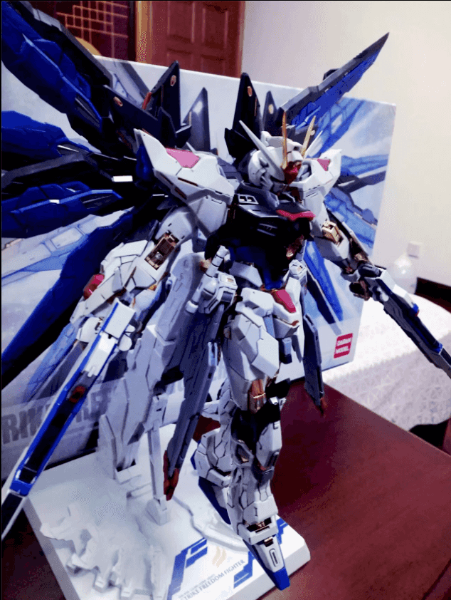
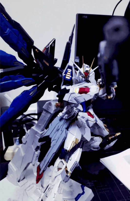
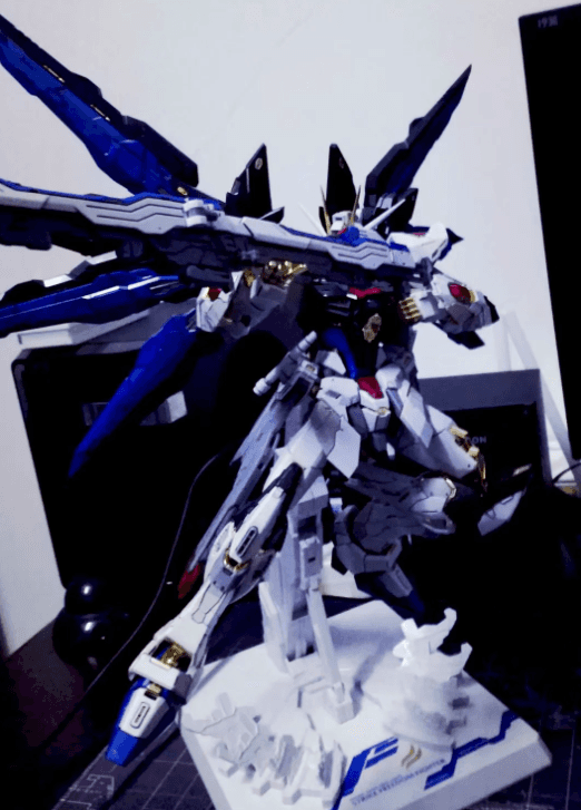
{% endcarousel %}
Use this card to join the PinGo and participate in a pleasant discussion together .
Welcome to Pin Young's PinGo , wish you a nice day .
 Cash
Cash ETH
ETH